Objective: Redesign a brand identity of an existing advocacy organization
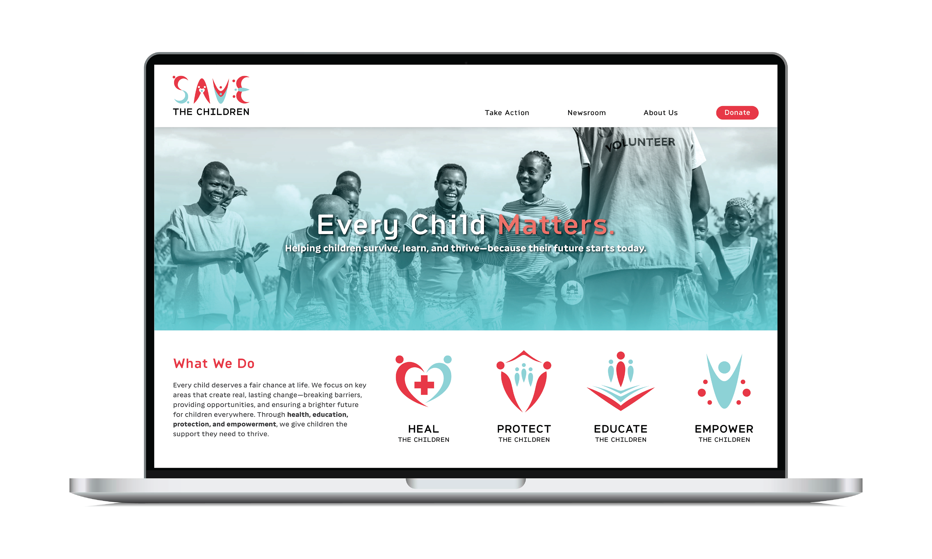
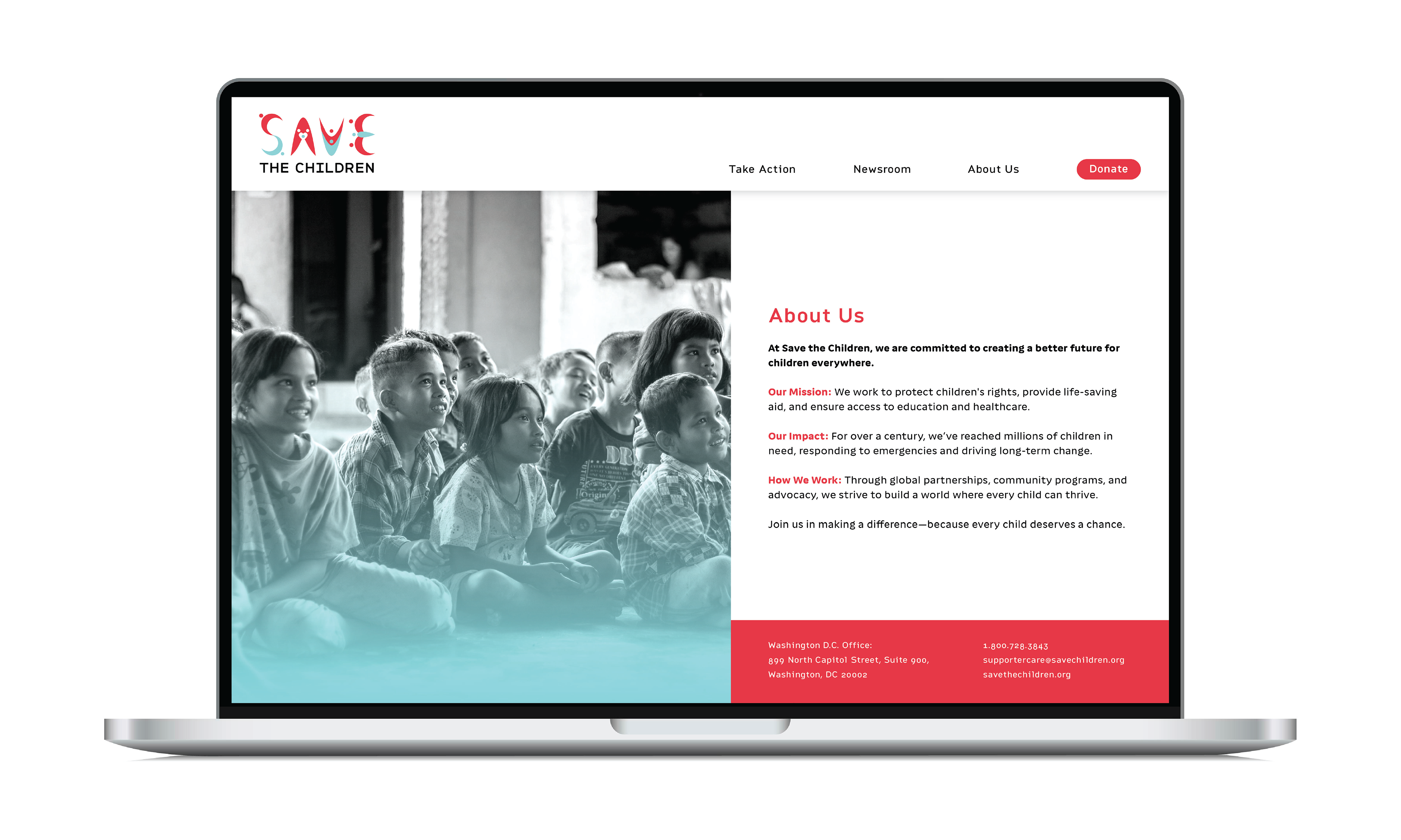
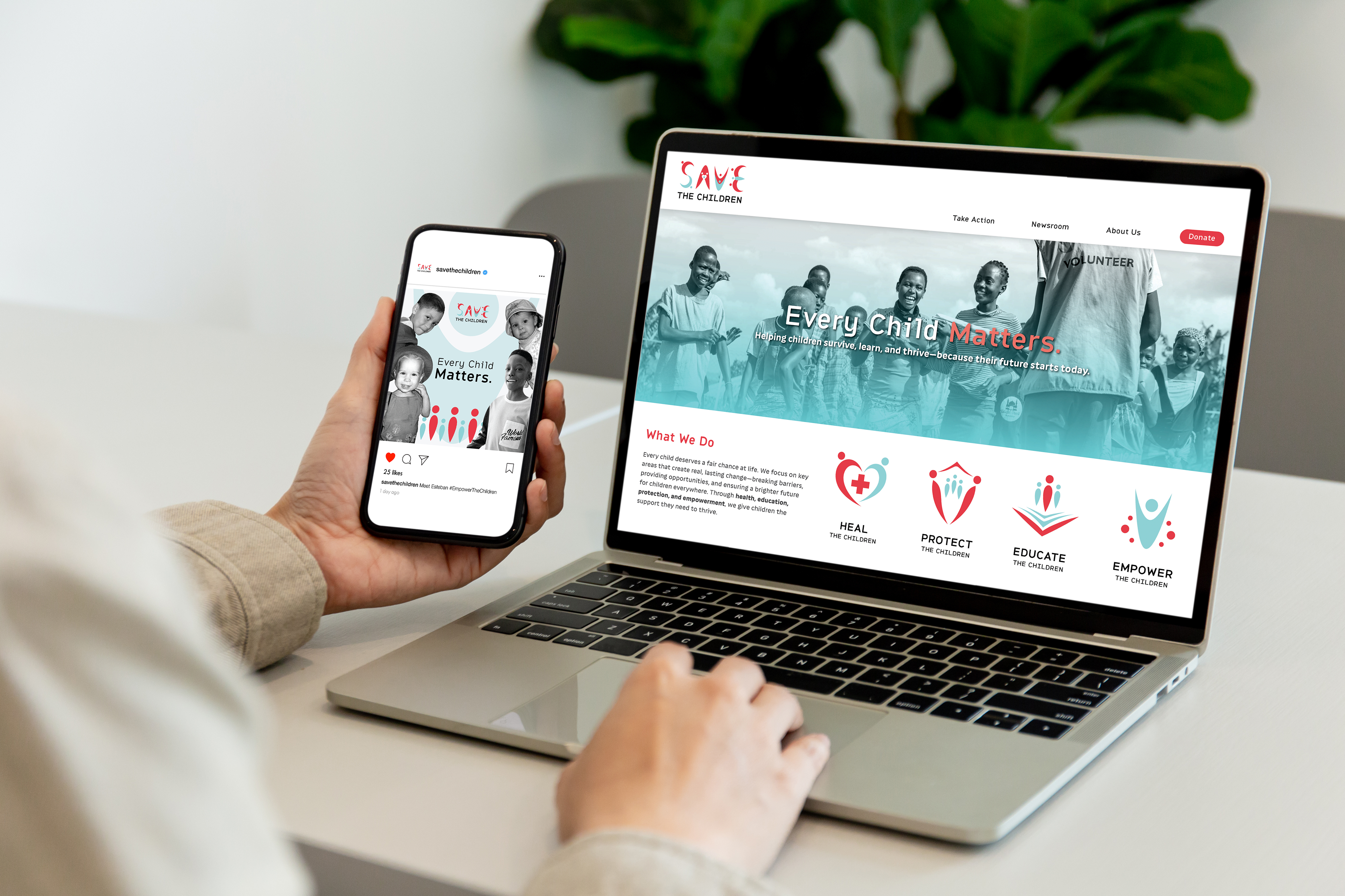
Approach: Rebrand Save the Children to stand out from similar organizations, while creating a flexible brand system that focuses on inclusive, audience-centered design
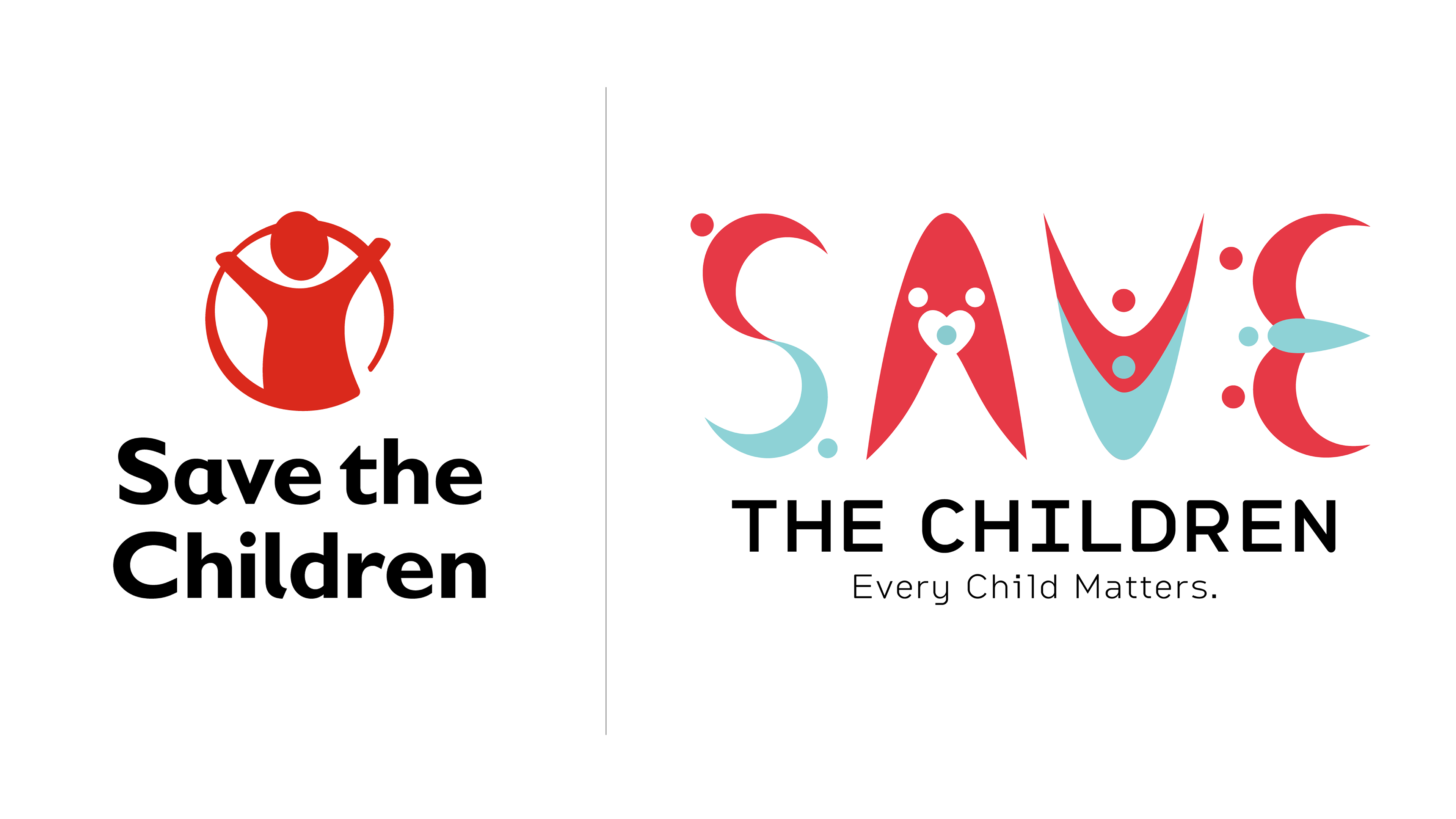
Original Logo vs. Rebrand
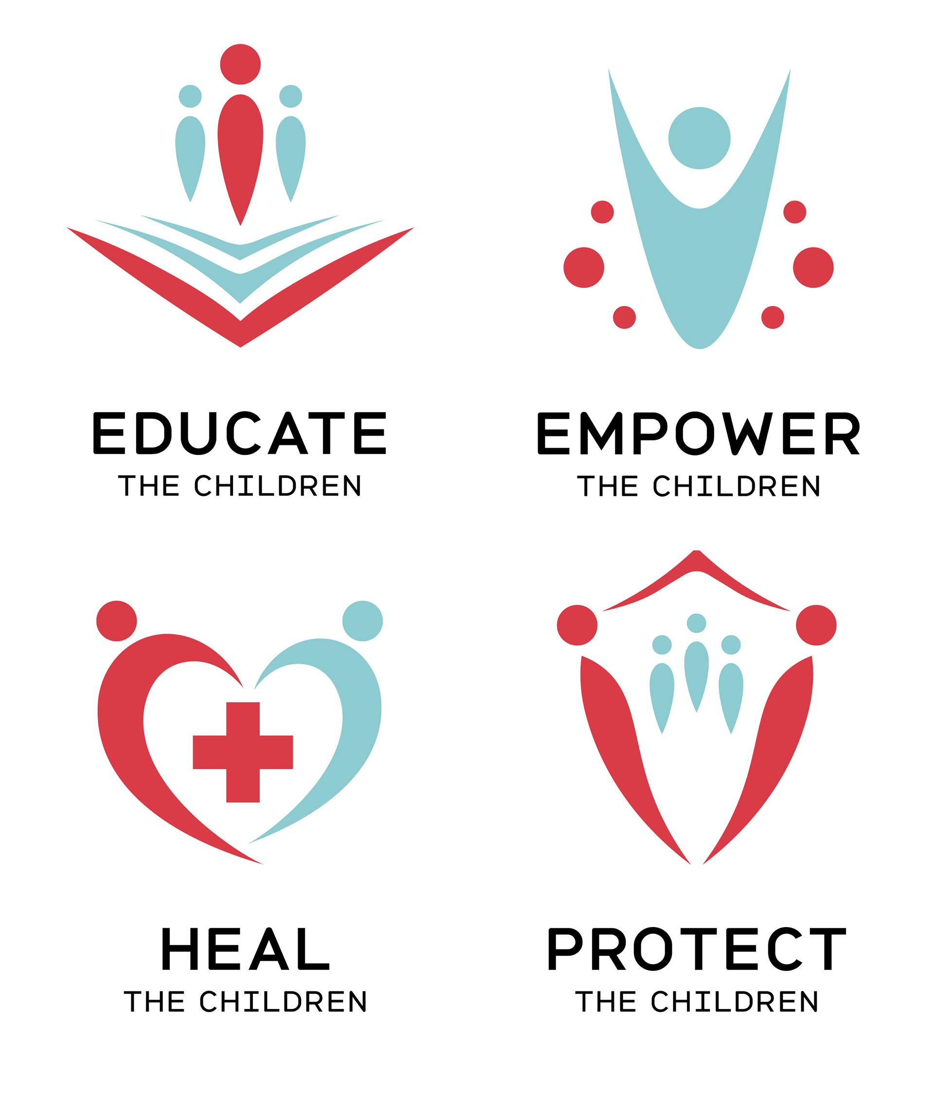
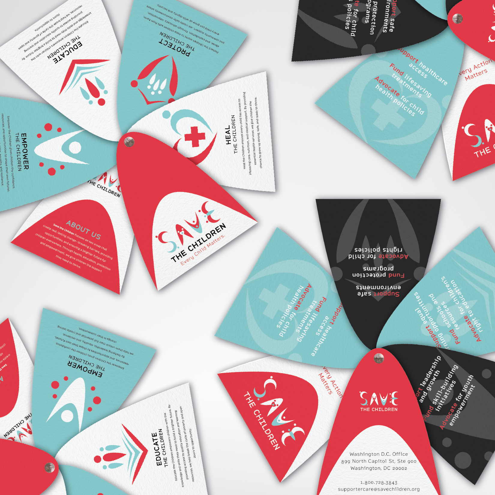
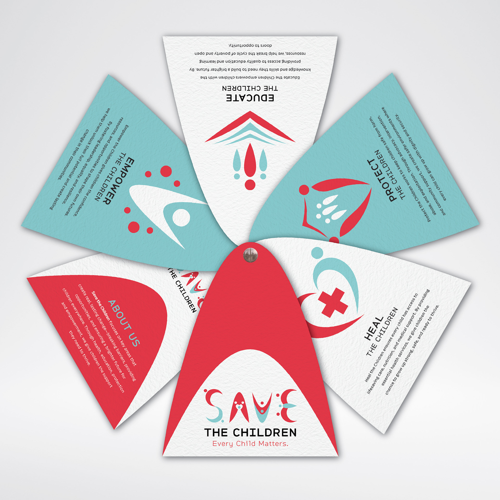
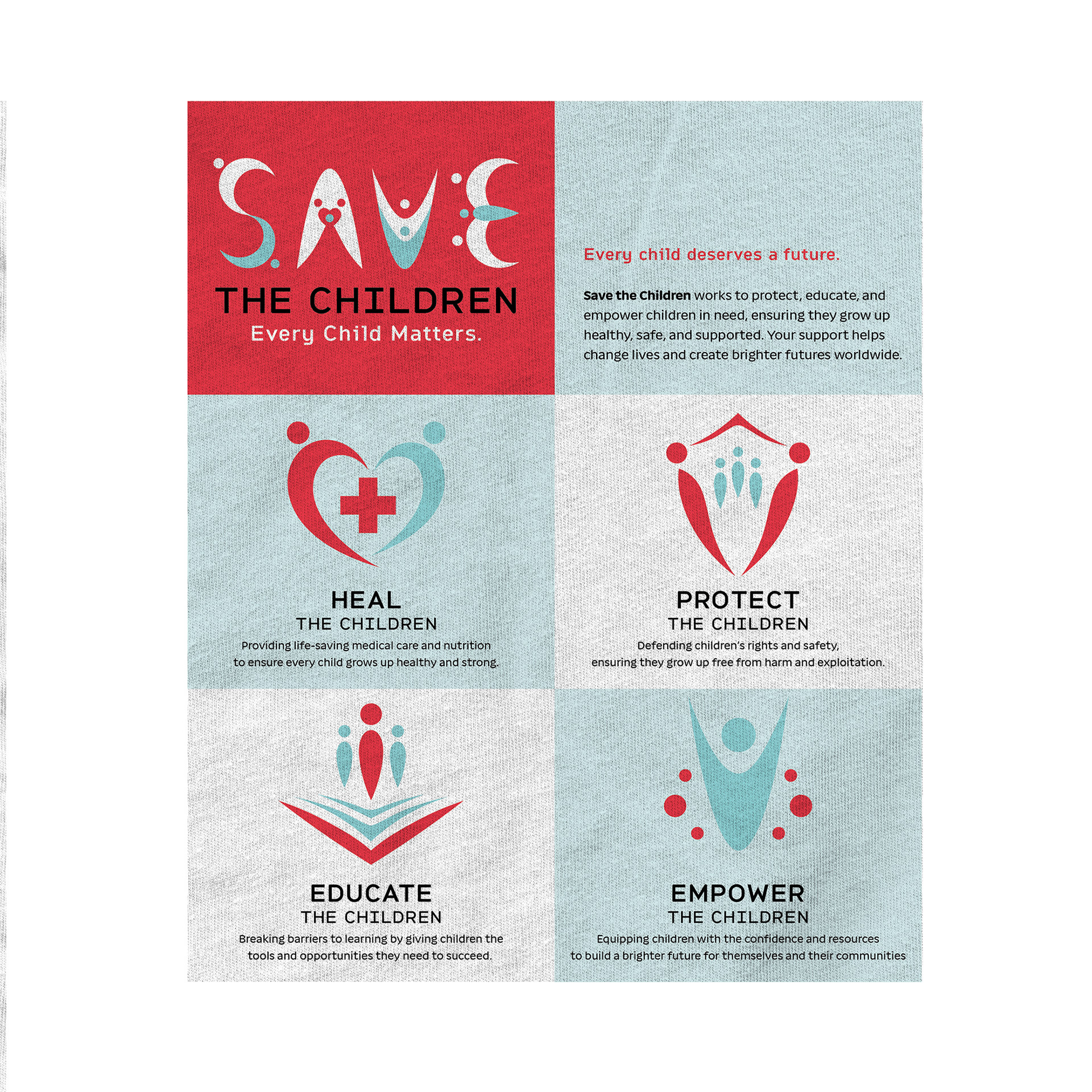
Sub-brand Logos
Redesigning the Logo
While the combined use of red and a child with their arms raised is a general gesture of empowerment, the original logo lacks distinction from other child advocacy groups.
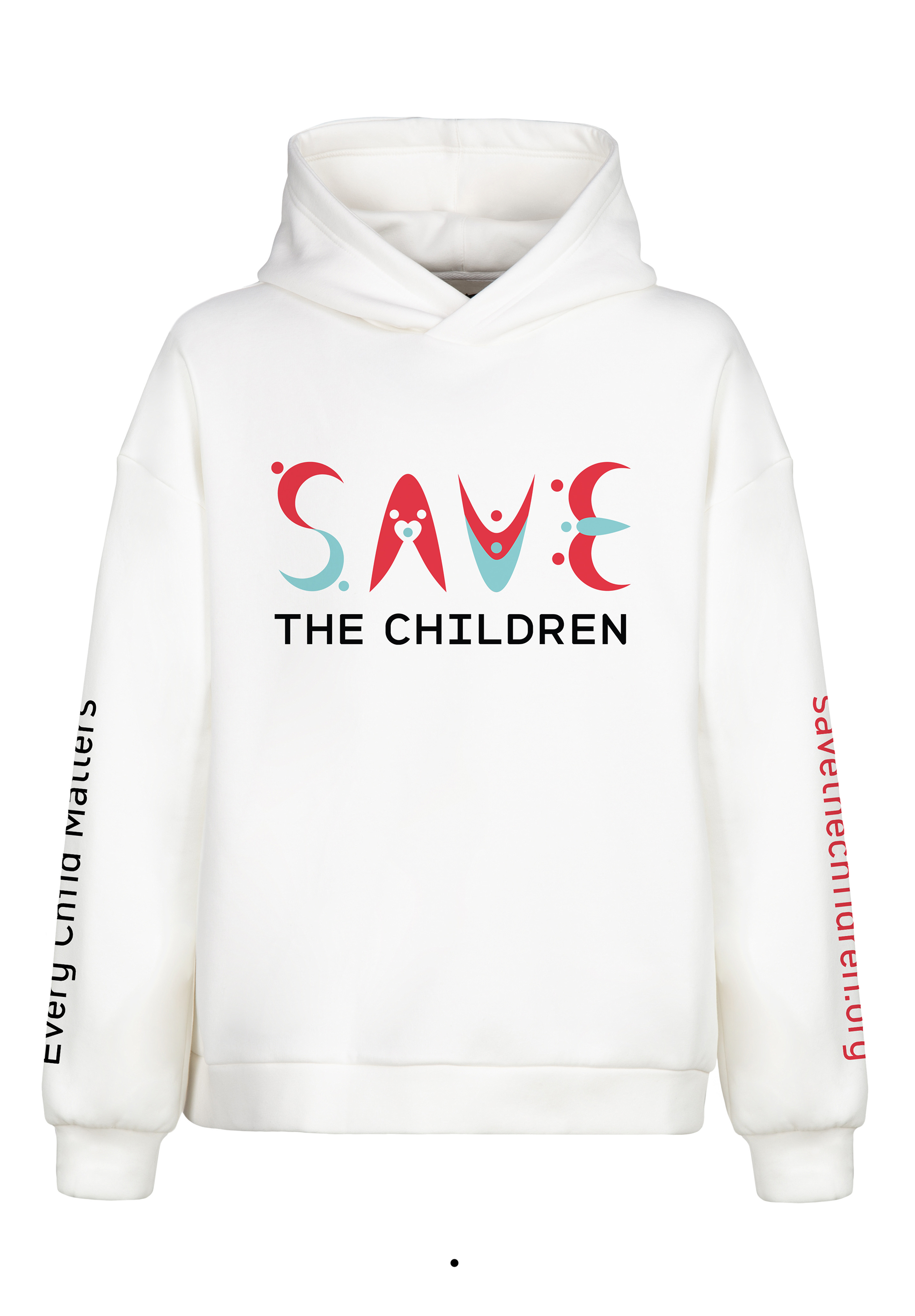
With my redesigned logo, I chose to represent different types of adult-child support, symbolic of their many areas of focus. The larger red figures represent the adults, while the smaller blue ones represents the children.
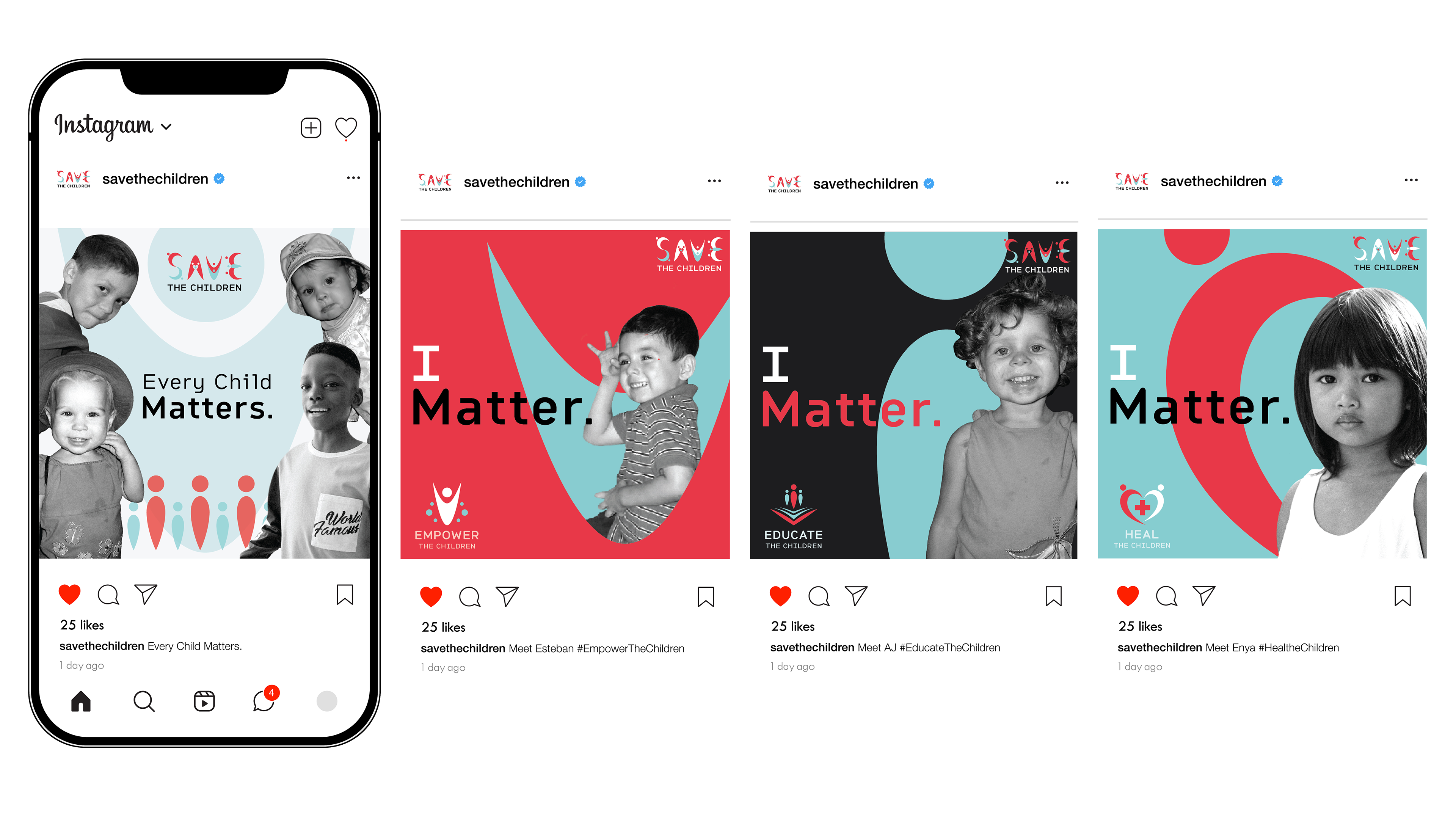
"I Matter" Social Media Campaign—Playing off my created tagline for the rebrand, "Every Child Matters."
Flashcards - Front Side
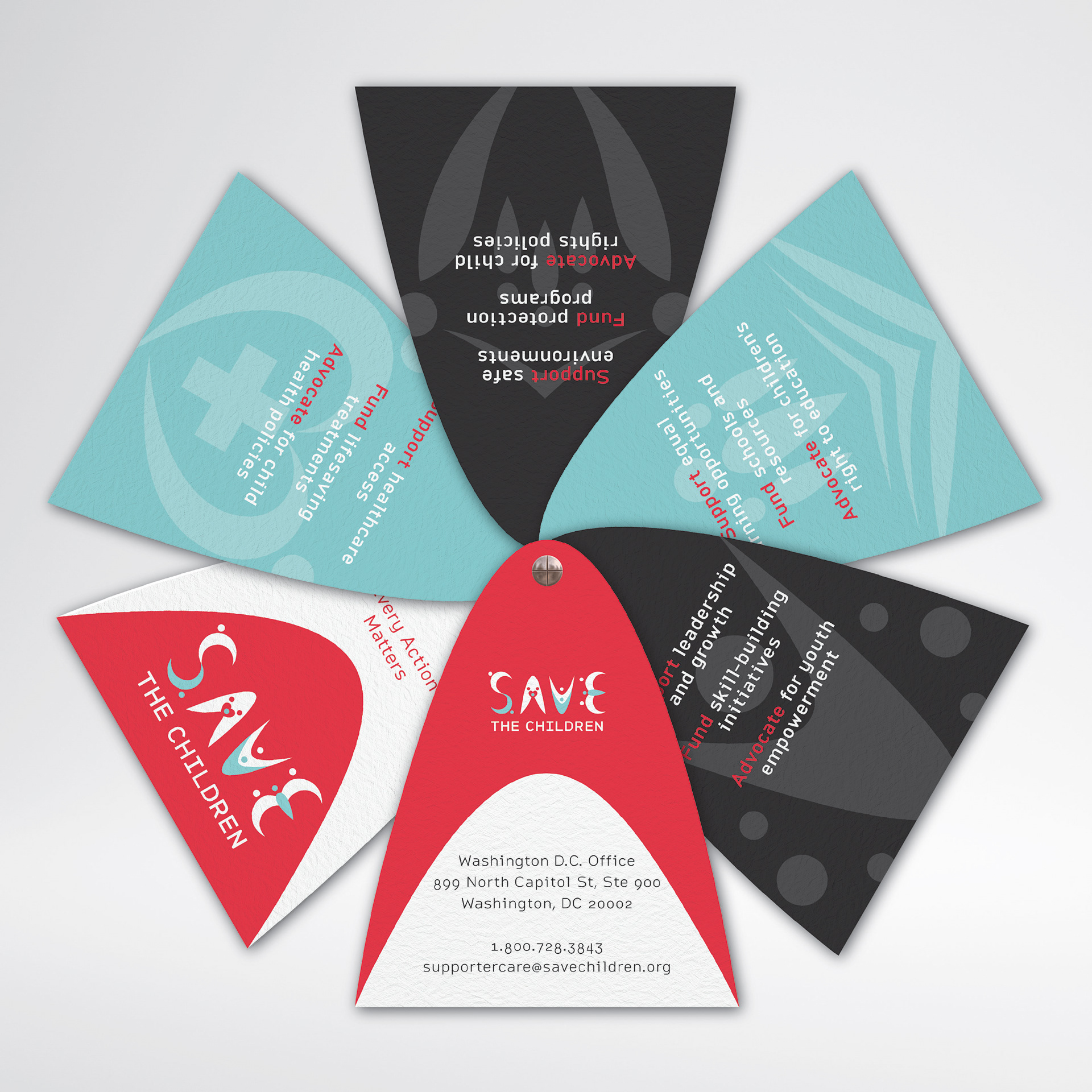
Flashcards - Back Side
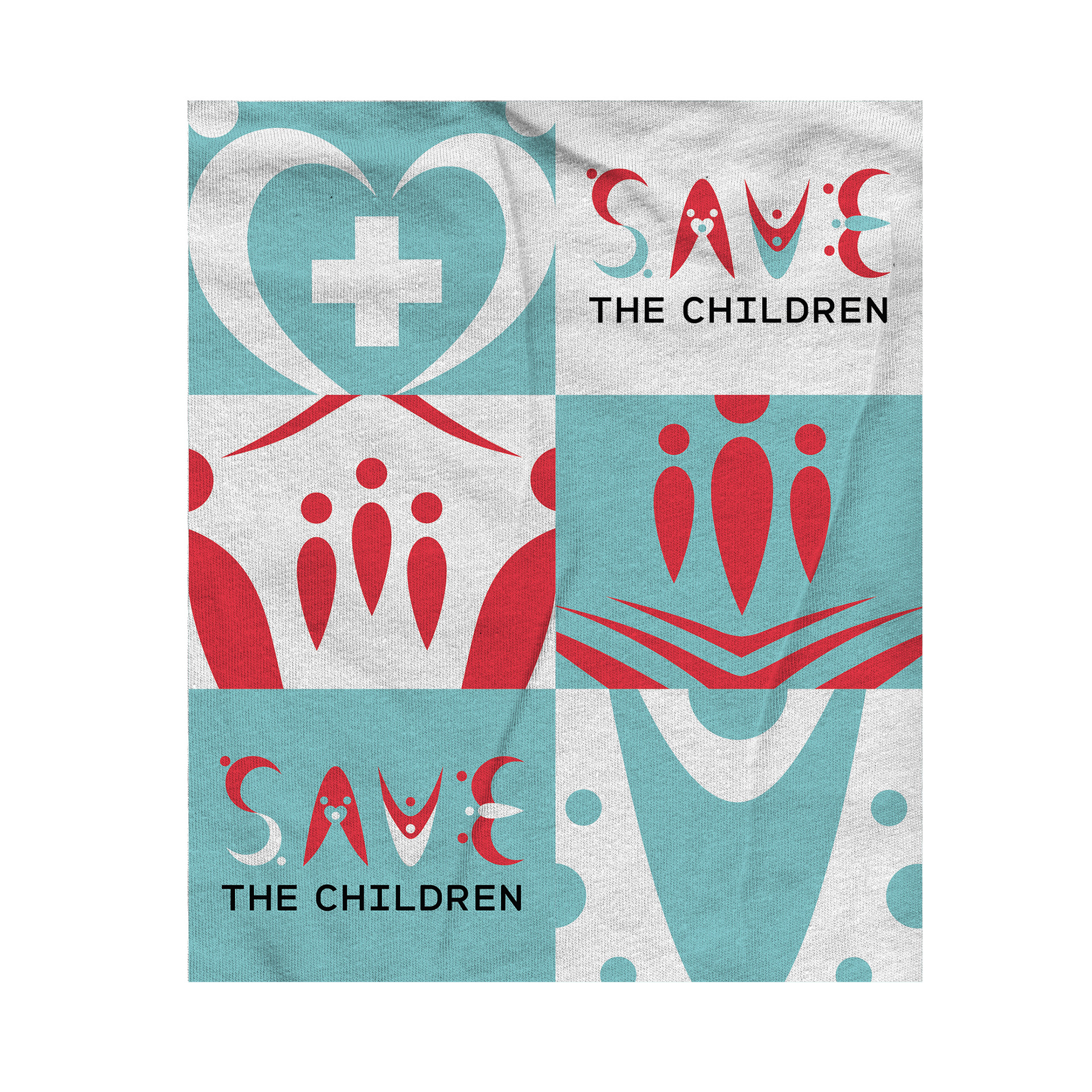
Blanket - Front Side
Blanket - Back Side